The Evolution of the Logo
When I first started considering a website, after I had already written a song or two that had been met with a positive response, I wanted to name that website with a play on words that would represent my ultimate goal. I figured using a play on words was a popular thing to do–it was everywhere. Rappers used it to select their performance names, companies used it to name their products. It was just a fun, clever, catchy way to present something. People “got it” when they saw the word play and liked it.
You already know, after listening to some of the songs and reading other pages on this site, that my ultimate goal is to convey to all of you teens my conviction of how important you and your future are–to motivate you to become your best selves, to achieve your full potential, to actualize. So I looked on the web to see if my domain name of choice was already taken. “Actual eyes” was indeed already taken by a small site that, for a long time, just used it as a place holder. I think it eventually was used by a company selling eye glasses in another country! Sooo…. I changed my name very quickly to “2 Actual eyes®” and am very glad that I did. To me it seems more distinctive.
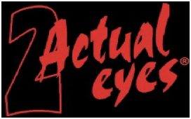
Once I had successfully claimed my domain name, I figured I needed to create some sort of logo that was eye-catching and memorable. By that time I was working with Todd, my music producer and beat maker. Our working relationship was evolving into a warm and happy friendship and he became my “go-to-guy” for a number of my technology-dependent creations. We had already started playing around with “Actual eyes” and modified our first attempt by putting a faint, stylized “2” in front of it. At that time we were creating the music for my lyrics for “Rita” and that heavily influenced that first logo. It was included in my first video attempt for “Rita.” The logo was pretty, with flourishes, and it included my own 2 actual eyes to make things interesting. (My plan was to put just the eyes of my vocalists on the website somewhere to play up the whole 2 actual eyes thing. That never happened…) I still like this logo, but I didn’t think it was going to accomplish what I wanted.
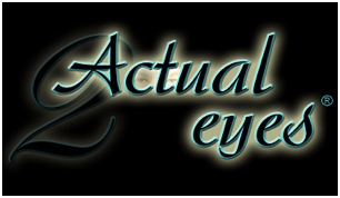
(a)
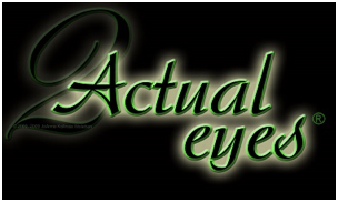
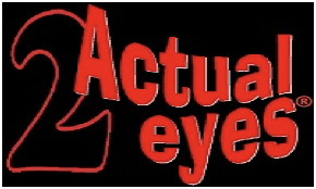
I decided to take my eyes out (!) and change the color to one that had a less “pretty” feel to it. The logo was basically the same thing with a little different vibe, I thought.
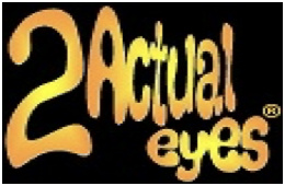
I came to the conclusion, as I wrote the lyrics for more songs, that in order to represent my works more accurately, my logo needed to have a more “edgy” look to it. I wanted it to look a little more like graffiti, so Todd came up with some different fonts for word art at his place, and I came up with a few myself at home. I used these a little bit on the former website that I had built on my own, and they appear in lyric videos that I was creating at the time and published later.
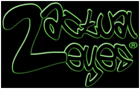
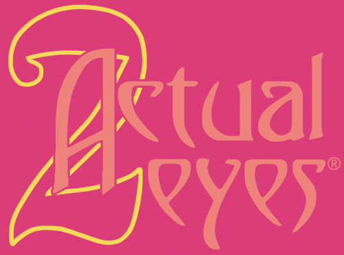
None of these logos really “grabbed” me until we came up with one that did!
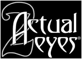
When we first put this last logo together, we used a weird font from a disk full of weird fonts. When we enlarged it to use it for the logo, we found that the pixels in each letter became huge and the edges of the letters were very jagged. The curve along the top, left edge of the “A” looked like stairs! We enlarged it really huge and Todd converted it to teeny, tiny pixels so I would be able to smooth out the edges. I only have very basic programs on my computer, nothing fancy or high tech, so over an extended period of time, I spent hours in the paint program of my pictures section filling pixels in all the jagged edges of this logo to try to give it a professional finish and “polish.” I was very happy with the way it turned out and proudly used it in my music videos that I posted on Youtube (they can be viewed on the Music page.) I thought of this logo as being unique, edgy, and easy to read.
Turns out that some of the people who went to my previous website (my attempt at a D-I-Y website) thought this logo went beyond edgy into grim and foreboding! That is not the impression I was after!! But since I had such a huge amount of time and effort invested in this logo, and therefore a matching amount of emotional attachment to it, I kind of balked at letting go of it. In an attempt to “soften” the first impression of it, I even put together an experimental short silent video, using the colors from my new and improved “2 Actual eyes®” website (where you are right now!) The video didn’t “make the cut” of having an official place on the website, since that logo wasn’t being used.
I knew the “feel” of that logo was an issue. But, in addition to that, I had to come to grips with a fact that was becoming more and more evident. Most people, when seeing any of my logos, did not “get” the “play on words.” I attached the name “2 Actual eyes®” to my works assuming that people would immediately think, “Ah, I get it! To actualize!” Apparently, because of the way I presented it, nobody got it. Bummer. They’d look at this “foreboding” logo and wonder, “What do eyes, actual or not, have to do with a music website?” Saying it out loud makes the connection easier, but, of course, viewers didn’t say it out loud–why would they!? So I had another reason to have to rethink my logo once again.
There have been many serendipitous events–happy coincidences–that have occurred as I have written the lyrics, produced the works, designed the logos, created the song art, built a website, copyrighted the material, registered the trademark, crafted the videos, etc. etc. The people I have met have been incredible. A whole string of serendipitous events led to my meeting and working with Todd. All those “happy coincidences” are what kept me going for all of this time.
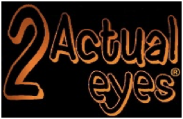
It was serendipity, at work again, that led me to Christa, my website designer and “do-it-yourself” guide for site updates and internet “how-to’s”. As we worked together, as she built my website, she designed several logos for me to consider. I ended up combining elements from several of them, making changes, and adding some flourishes of my own, to come up with a logo that is easy to read, keeps the integrity of my trademark, and, hopefully, helps make the transition from “2 Actual eyes®” to “to actualize” easier to recognize. It is now the logo that is being used on this website–as you can see!
My intent in all of this–the songs, the website, the logos, everything–is to convey my personal message to you. It is not to sound preachy or pedantic (teachy!). It is all meant to be a sincere expression of my high regard for you and your potential. It is meant to express my conviction of the importance of your impact on the future of the world–truly, absolutely, straight up!
So, now I am asking you for your thoughts! I would like your opinion about these many logos, used and unused, old and new. Each of the logos has a letter under it. Please go to the Contact page and let me know what your impressions are and which is your favorite. In keeping with all of our efforts to actualize, I would find your thoughts very helpful! Thank you!
©JoAnne Kollross Woleben